

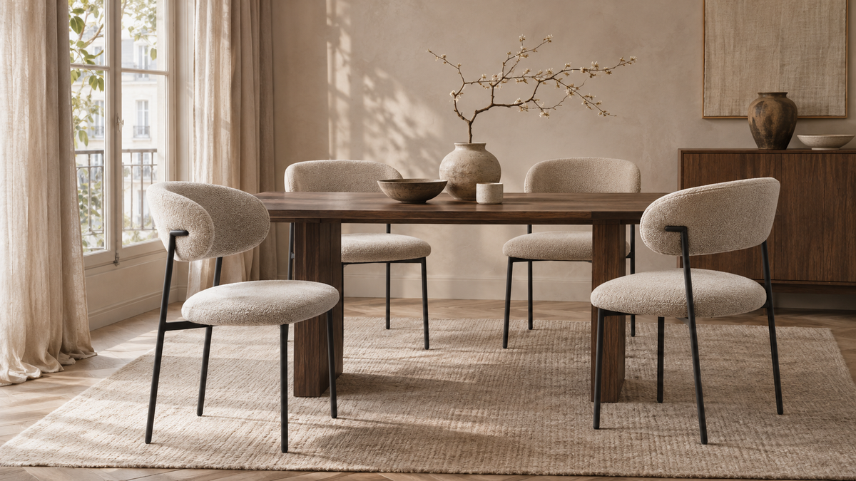
Choosing between Japandi and Scandinavian dining room ideas is easier when you begin with the atmosphere you want at an ordinary meal. Perhaps you enjoy a room that feels open, sociable and easy to rearrange. Perhaps you prefer a quieter composition, where a few substantial shapes and carefully chosen surfaces hold your attention. Both directions can support a comfortable home. Their names alone do not tell you which chair will fit your table or suit your daily routine.
This guide treats the two styles as useful starting points for making decisions. You will compare silhouettes, materials, visual weight and the objects already in your room, then work through two different household examples. The aim is a dining space with a clear character that still belongs to you. A room can borrow from both directions, keep an inherited table and accommodate the practical details of family life.

1. Understand what the style names can help you decide
Japandi is a contemporary interiors label for combinations of Japanese and Scandinavian influences. It is not a single historical furniture category or a guarantee of Japanese craftsmanship. In a dining room, the label often points towards a restrained composition, considered gaps between objects and close attention to material surfaces. Those are useful design choices to test, rather than compulsory rules about colour or the number of possessions you may own.
Scandinavian design covers a much wider range of places, makers and periods than a white room with pale timber. For a home project, a Scandinavian direction might emphasise useful furniture, a readable structure, a welcoming atmosphere and room for everyday activity. It can include expressive colour, dark wood or substantial upholstery. You do not have to remove personality to make the room feel coherent.
Use the labels to describe a preference you can actually see. “I like the space around the furniture in this image” is more helpful than “I need everything to be Japandi.” Likewise, “I want the dining area to feel light when the chairs are pulled out” gives you a concrete test for a Scandinavian reference. Write down the quality that appeals to you before shopping for the label.

2. Start with the room you have, including its difficult parts
Stand in the doorway and list the elements that will stay: floor, table, kitchen fronts, windows, radiator and any large storage piece. Note which surface occupies the most space and which shape attracts your eye first. A dark floor, a thick table edge and a tall cabinet already create a stronger visual framework than a photograph of a nearly empty room might suggest. Your new chairs have to work within that framework.
Take a second photograph from a seated position in the living area if the spaces connect. Chair backs may be more visible than the table setting. A change that looks subtle from above can become the main feature from the sofa. Look at doorways too: does a tall chair back interrupt a view you value, or does it give the dining area a useful boundary? Neither answer is universally right.
Describe the room with three factual observations before choosing three mood words. “North-facing window, warm oak floor, black kitchen handles” keeps your plan grounded. “Quiet, tactile, welcoming” then guides the choices. If the mood words clash with a fixed element, decide whether that element needs balancing or celebrating. This prevents a new set of chairs becoming an attempt to solve every feature of the room at once.

3. Compare silhouettes before upholstery colours
Look at a chair as an outline first. Follow the top of the back, the transition into the seat and the way the legs meet the floor. Does the form read as one continuous volume, several clear components or a rounded shell on a fine base? The relationship between those parts often matters more to a style direction than the colour name printed beneath the photograph.
For a restrained Japandi-inspired composition, you might favour a small number of deliberate shapes with a clear relationship to the table. A generous curve can work as well as a straight line if the surrounding pieces give it space. For a lighter Scandinavian-inspired arrangement, you might compare models whose structure stays visually legible when several chairs sit together. These are compositional approaches, not origin claims about the products.
Repeat the outline test with a whole row. One sculptural chair can look calm in isolation while six strongly shaped backs create a much busier rhythm. Make a simple collage showing the actual number you need, using front, side and rear views where available. Then check the real dimensions. Visual lightness does not establish a narrow footprint, and a substantial appearance does not tell you how much a chair weighs.

4. Give materials different jobs
Begin with the largest material already present. If the table has a pronounced grain, allow it to remain the strongest pattern and use the chairs to provide a quieter surface. If the table is very smooth and simple, a textured upholstery can bring interest at the human scale. The aim is a relationship between surfaces, rather than a collection of objects that all compete to demonstrate natural character.
Material names need practical interpretation. Wood may have a coating that changes both its appearance and care requirements. A fabric described as linen may be a blend, while a visibly textured surface can have a different composition from what a photograph suggests. Check the chosen product description and care instructions. A design reference can guide the look, but it cannot confirm how a material feels or performs.
For either style direction, make a small board with the actual floor, table and upholstery candidates. Include a photograph of the table edge, not just its top. That edge sits close to the chair and can make the combination feel delicate or heavy. Record what each surface contributes: structure, softness, contrast or a visual pause. If three materials all perform the same loud role, simplify one of them.

5. Build a palette around your existing light and surfaces
A palette is more useful when it describes relationships than when it lists fashionable shades. Choose a background, a main furniture tone and a limited accent. The background may already be set by your floor and walls. The chairs can then connect that background to the table or introduce a deliberate difference. You do not need to give every object an exact colour match for the room to feel considered.
A Japandi-inspired plan might use a quieter range of tones with a distinct dark outline somewhere in the composition. A Scandinavian-inspired plan might leave more space for a brighter or more playful accent. Either approach can also take another form. Treat the comparison as a way to establish your preference for contrast, rather than a rule that one style must be beige and the other white.
Keep a written note of what stays constant when you compare candidates. If you change the chair, table, wall colour and accessories in every moodboard, it becomes difficult to know which decision improved the room. Use the same room photograph for each option and change one main element at a time. Final colour assessment still needs the actual room conditions and the information available for the selected upholstery.

6. Use texture to create depth without filling every surface
Texture is especially useful when you want a restrained room to feel inviting. Think about how the room looks at three distances: from the doorway, from the neighbouring seat and close enough to touch. A fabric with a pronounced weave may be quiet from across the room and expressive at the table. A smooth surface may give the eye a rest beside a richly grained piece of furniture.
Avoid making every layer equally noticeable. You could let the upholstery provide the soft texture, the table provide visible grain and a small ceramic object provide an irregular detail. Adding several patterned textiles, heavily textured walls and a busy centrepiece may weaken the clear composition you liked in the first place. Remove one layer in your mock-up before assuming you need to buy another.
Practical care belongs in this decision. Read the instructions for the exact fabric and consider the activities at your table. A textured chair that looks right should still fit the way you clean and use the room. Keep decorative styling separate from product performance: a calm photograph cannot establish stain resistance, durability or comfort. Ask for missing information before treating any material as the easy-care option.

7. Compare the two directions through decisions, not stereotypes
For visual weight, compare a few anchored forms with a more open rhythm. For material emphasis, compare a concentrated material story with a lighter mix of useful everyday pieces. For display, compare a carefully spaced selection with a slightly more relaxed arrangement of books, ceramics or family objects. These comparisons help reveal preferences without pretending that all Japanese or Nordic homes look alike.
Both directions can use curves, dark finishes, colour and upholstered chairs. Both can also be warm or cool depending on the particular choices. The useful question is how the pieces behave together. Does the room feel clear when the table is set for dinner? Do the chair backs and table base make a balanced group from the main viewpoint? Can the objects you enjoy stay visible without taking over the composition?
Make two honest concept boards with the same existing table and floor. In one, reduce the number of competing shapes and strengthen the relationship between the main materials. In the other, emphasise openness and everyday flexibility. Give both a realistic place for storage and the items used at meals. Compare these believable rooms rather than a styled photograph with an empty version of your own home.
| Decision | Possible Japandi direction | Possible Scandinavian direction |
|---|---|---|
| Overall outline | A few deliberate, anchored shapes | A readable, more open rhythm |
| Material emphasis | A concentrated relationship between surfaces | An approachable mix of useful pieces |
| Contrast | A quiet range with a clear anchor | An open base with room for an accent |
| Objects on display | A spaced selection with a distinct role | A relaxed arrangement that stays usable |
| Daily use | Storage that supports a clear composition | Flexibility that supports everyday activity |

8. Worked example: keeping a dark wooden table
Imagine a household that wants a calmer dining area but already owns a dark wooden table with a substantial top. The floor is warm and mid-toned, the walls are light and the room contains a sideboard used every day. The table is staying because its size and condition suit the household. Their brief is “quiet and welcoming, with enough character to avoid looking unfinished.” This example is a design exercise, not a description of product specifications.
The first option takes a Japandi-inspired direction. The table remains the main anchor. The chairs introduce one consistent, quieter upholstered surface and a shape that gives the table edge breathing space. The sideboard display is reduced to a few objects with different heights, leaving a useful clear area. A broad, simple light fitting connects with the table rather than adding another intricate outline. Nothing needs to imitate Japanese craft to make the composition more deliberate.
The second option keeps a Scandinavian-inspired openness. The household chooses a chair outline that leaves the lower part of the table visually readable. A modest colour accent appears in a useful object, while the remaining accessories are relaxed and easy to move. The dark table becomes a contrast within a lighter setting. Compare both options with the chairs pulled out: the preferred style must work during dinner, when the furniture occupies more space than in a catalogue photograph.

9. Worked example: a bright dining area in an open living space
Now imagine an apartment with a pale floor, simple kitchen fronts and a dining table visible from the sofa. The owners want the dining area to have a distinct character without separating it from the rest of the room. They regularly move between the table and kitchen, and the table also holds paperwork during the week. Their brief is “a clear dining zone that feels comfortable in a busy shared room.”
A Scandinavian-inspired approach could use a readable chair rhythm, a useful storage solution and a repeated material detail that connects the dining area with the living furniture. The chairs should look considered from behind because that is the everyday view from the sofa. A personal print or colourful vessel can supply individuality. The plan allows items used during the week to be put away quickly, so the room can return to its dining role without a complete restyling.
A Japandi-inspired alternative could give the dining group a more concentrated outline and reduce the number of decorative elements around it. One substantial object may work better here than several small ones scattered across the table. The design still needs somewhere for papers and chargers. Compare the two plans after adding real household items to the drawing. A style that only works when everything is hidden may require a storage change before a furniture purchase.

10. Make a decision worksheet you can use while shopping
Divide a page into four columns: what stays, what needs to change, what you want to feel and what you still need to check. Under “stays”, write the actual table, floor and large storage pieces. Under “change”, identify one or two concrete problems such as competing chair shapes or a display that dominates the room. Mood words belong in the third column. Product dimensions and maintenance questions belong in the fourth.
Choose three visual criteria that you can assess consistently. For example: the chair back should sit calmly beside the table edge; the main material should connect with something already present; and the whole row should leave the room visually open. Keep your practical requirements alongside them. A style preference should not persuade you to accept a chair that catches the table apron or interrupts an everyday route.
Photograph each shortlisted combination from the same viewpoints. Use a simple status for every criterion: fits the brief, needs checking or conflicts with the brief. Explain the answer in a sentence rather than giving an unexplained score. If two people in the household disagree, identify the exact point: outline, texture, contrast or degree of display. That gives you a manageable design decision instead of a debate over which style name is correct.
- Photograph the table, floor and main viewpoints.
- Keep three practical requirements beside three visual preferences.
- Compare two or three exact model variants.
- Resolve missing dimensions and care information.
- Test the whole group during an ordinary meal.

11. Use Colenis models as visual candidates, then verify the variant
Start with a small shortlist in the Colenis dining chair collection. Daria can be considered as a visual candidate for a Japandi-inspired composition. For a Scandinavian-inspired direction, candidates worth comparing include Daria, Mira, Julia, Levan, City, Leo, Anabella, Metropol, Curve and Sara. These suggestions concern design compatibility; they do not state that the models have a particular national origin or certified style status.
Look at each candidate in the finish you would actually order. A model name can cover different colours, upholstery options or leg finishes. Compare the front, side and rear images with your table, then check the published dimensions and care information. Leo and Leon are different model names, so keep the exact name and selected variant in your notes. An attractive image should lead to a closer comparison, not replace it. Check current availability and the exact variant details before including a model in your final shortlist.
Keep the shortlist short enough to explain. Two or three candidates with clear reasons are easier to evaluate than a large folder of similar photographs. Write one visual reason and one practical question beside each. For example, you might like how a backrest outline relates to your table while still needing confirmation of the arm height. Resolve those questions before selecting an entire set.

12. Refresh the room in a useful order
Begin with an editing session using what you already own. Clear the table, move the display objects and photograph the room. Return the items that have a purpose or personal meaning. This shows whether the difficulty comes from the furniture itself or from the number and placement of smaller objects around it. You can often make the next purchase more precise after this exercise.
Next, settle the main furniture relationship: table, chairs and the large storage piece. Test that combination in your photographs before choosing decorative layers. If the budget allows only one change, select the change that addresses the clearest problem. Replacing functional chairs solely to meet a style label may offer less value than fixing storage, adding suitable lighting or simplifying an overfull display.
Finish with a short period of ordinary use. Eat at the table, tidy it and view the room in the evening. Notice which decisions still work when the room is active. Keep the plan flexible enough for a new object, visiting family or a favourite piece that does not fit neatly into either label. A coherent room can evolve because its relationships are clear, even when its contents change.

13. Recognise the mistakes that make a styled room feel impersonal
The first mistake is buying every item from one reference image. A photograph may depend on an unusual ceiling height, a hidden storage wall or a room much larger than yours. Borrow a relationship you understand, such as a curved chair beside a simple table, and test it in your own setting. That approach gives you a reason for each choice.
Another mistake is using the style label to judge materials or people. An affordable upholstered chair can participate in a considered room. A handmade object is not automatically a good fit. A family photograph does not have to disappear because it is more colourful than the palette. Give personal objects an intentional place and let useful furniture do its daily work.
Finally, avoid treating an unfinished plan as a failure. Live with the main furniture before adding the last decorative layer. If the table works, the chairs fit and the room supports the way you gather, you already have a strong foundation. The final atmosphere comes from the balance of those decisions and the life in the room, rather than perfect compliance with a trend name.
Frequently asked questions
Can I combine Japandi and Scandinavian ideas in one dining room?
Yes. Choose the qualities you want to retain, such as a clear furniture outline, useful everyday storage and a restrained material palette. Build them around the same table and floor so the result feels intentional. You do not need an equal share of each label. A coherent room comes from repeated relationships and practical choices that work together.
Does a Japandi dining room have to use beige chairs?
No. Beige is one possible choice, not a requirement. Dark upholstery, muted colour or a stronger contrast can also suit a restrained composition. Compare the chair with your existing table, floor and walls. Assess the whole group and the actual selected fabric rather than assuming that a particular colour automatically creates a style.
Can I keep a dark table in a Scandinavian-inspired room?
Yes. A dark table can become a deliberate anchor within a lighter setting. Compare chair outlines that let the table structure remain readable, and connect the table to another modest dark detail if that helps the composition. Keep the practical fit of the chairs and the room’s existing surfaces central to the decision.
Are the suggested Colenis models authentic Japanese or Scandinavian designs?
The suggestions in this guide describe visual compatibility with a room direction. They are not claims about national origin, designer attribution or certification. Check the product page for the exact model and variant, including its dimensions and materials. Style suitability and verified product information answer different questions during your purchase decision.
Which should I decide first: the chairs or the room palette?
Begin with the fixed surfaces and the table you intend to keep, then make a provisional palette and compare chair candidates within it. If the chairs are the main planned purchase, allow their available finishes to refine the palette. Keep one room photograph constant while comparing options so you can see which change makes the difference.
How can I make either style feel personal?
Keep objects with a real role or meaning and give them a clear place. A family print, a useful serving bowl or an inherited sideboard can sit comfortably within a considered plan. Leave enough space around them to appreciate their shape and story. Review the room during ordinary use so the design supports your household rather than a photograph.
Your next step
Choose the direction that best supports your room, then describe it through practical decisions: the outline of the chairs, the role of each material and the balance between display and clear space. Keep a photograph of the actual table and floor beside every new candidate. That makes a style idea useful at the moment of choosing.
You can start with a Japandi-inspired calm, a Scandinavian-inspired openness or a considered combination. Preserve the household’s needs and personal pieces throughout. When the table works for everyday meals and the furniture relationships feel clear, the room has a character that will remain useful beyond the current styling trend.
Use your room worksheet to compare a small shortlist of chair models and the exact finishes that suit your table.
Explore dining chairs ↗


